Unit 06_ Visual Development : Environment Concept Arts
- seobin051013
- 1월 21일
- 4분 분량

Bank's children room

Designing children’s room requires to consider the item’s material and textures which are flexible depending on the era. I also had to research British children's literature and toys from the mid-to-late 1960s, and I referenced the cover illustration from < The Twins at St. Clare's >, one of Enid Blyton's storybook series.


Furthermore, to capture the period feel, the family photograph hanging on the wall was rendered in black and white. Given the perspective of an adult reminiscing about childhood, the colors of the toys were set to low saturation and low brightness.

Children's bedrooms in 1960s Britain commonly featured floral, pastel wallpaper patterns, and carpets were more common than wooden floors. Therefore, when rendering the wallpaper and flooring, I set the Procreate layer to “Multiply” and adjusted the opacity to achieve a realistic appearance of a home where a child actually lives, rather than an exaggerated set.
On top of this, I added additional details: scribbles that a child might leave on the wall with crayons, positioned at a child's eye level on the right-hand bed and the adjacent wall. I also incorporated traces of children's height measurements on the side of the left wardrobe.


During this concept art, I had been pondering how to depict this space as a set where a very young child plays and takes naps. I imagined the children sleeping in a comfortable spot within the space, perhaps not in a proper position but lying face down, or even with their feet propped up on a pillow. This led me to arrange Jane and Lily's sleeping poses. To depict them having played with their tea set on the carpet between the beds before napping, I scattered toy teacups and a teapot haphazardly.
London West End Theatre

As the core theme is an adult’s perspective reminiscing about childhood in the mid-to-late 1960s, the film had to depict the London West End theatre district at the time.
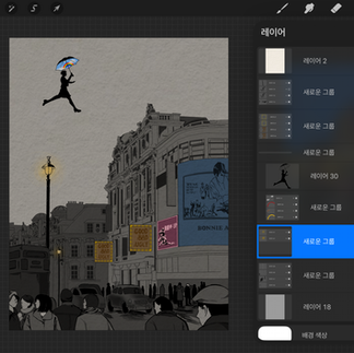
Overall, almost colors of this concept art are Black-and White but some parts of it are low-tone colors because the main concept statement of this project is the adult’s perspective recalling her childhood in 1960s.
To be specific, childhood recollections become “records” in black-and-white photographs, yet “memories” remain in the mind in color rather than monochrome, the more vivid the impression. Reflecting this visually, the camera records what can be remembered in black-and-white, while the things the child deemed special – such as the silhouette and umbrella of Mary Poppins and the cinema sign painted by Bert, are rendered in relatively vivid color.

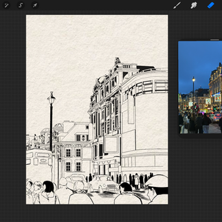


In order to get the direct reference image for the theatre district, I had been in there on 25 January 2026. Then, I began to get roughly lined sketches through the Procreate 's layer opacity function.
Based on photographs taken directly on the theatre streets of central London, line drawings were created. The clothing of people on the street, along with cars and buses, were sketched using reference materials. The opacity of the outline layer for buildings at a relatively greater distance was reduced, and the folds in the clothing of people on the street (those closer) were depicted in greater detail. Subsequently, the lighting of street lamps and cinema signs were colored in. To achieve overall harmony, feedback suggesting the use of low-saturation, low-luminance colors was incorporated.
In the Fantasy World

This concept art illustrates the fantasy world related to the children’s paper craft. In the previous concept art depicting the children's room, the paper-based artwork affixed to the wall mirrors this visible painting. To convey realistic waves, a transparent layer of an image rendered in 3D Blender was overlaid. By incorporating paper cranes, paper boats, and fish crafted, the children's play world was dramatically expanded into a fantasy realm, depicted from a high angle.
I drew inspiration from scenes in films where children fly kites, and I wanted to create a fantasy where paper boats or fish (from the real world) are portrayed not as inanimate or fixed entities, but as living, fluid things that transform.
Craft materials share considerable similarities with children's play in that they expand imagination through “constraint”. Paper-folding games like paper airplanes or paper boats, known as Japanese origami, were already commonplace within households as play activities.


Once the composition and object placement are finalized, the base colors are added and the desired color scheme is swiftly determined.

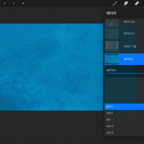


I inserted the Blender-rendered image into Procreate ayers, converted it to multiply mode, then sketched the basic shape of the paper boat as seen from above before drawing the characters on top.


After adding the base color on the objects, it requires to have shading and adding the texture of the paper. So, I putted the image of lined-note paper and watercolor paper under by using “Clipping Mask” layers.


To change the layer into ‘Multiply’ can add the depth of place. Thus, I had added the lighting layer on the darken layer on the last process of this concept art.


댓글